Wednesday, 26 February 2014

GSoC 2014 mentoring organisations announced, review and apply!


After sorting through almost 400 applications of mentoring projects, Google has announced this year's list of projects students can contribute to.

There aren't too many FOSS gaming related projects this time though.
These are the relevant ones:

If you are not into game developer but would still like to contribute your programming skills I recommend you to have a look at these other selected projects (totally subjective and unsorted list):  Non-profit accounting, Mifos, Mixxx, Freifunk, OSGeo, Sahana & ProjectTox.

Tuesday, 25 February 2014

Share Blog Posts in Social Media using AddThis

AddThis is the most complete social sharing service allowing you to share your posts in more than 270 different social networks. If you want to use the AddThis widget and get the AddThis sharing buttons, this tutorial will show you how to register and add this feature on your blog. Plus, you will get to know some of the customization options of these buttons. So let's get started!

Getting the AddThis share buttons code

Step 1. Visit the https://www.addthis.com/get/sharing page.

Step 2. To get the sharing buttons and to access the AddThis sharing stats to find out how many people shared your post by using the AddThis feature, click on the "Create account" button.

create addthis account

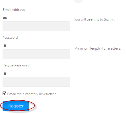
The site will ask you to make a small registration. Fill out the information to register. It's quick, simple and it's free. To finish the registration, click on the Register button.

register addthis

Step 3. After you've been logged in, right below the "Get sharing buttons for", choose the "A website" option.

addthis share buttons

Step 4. In the "Select style" section, choose the buttons style that you think would look the best on your site/blog. Please note that on the right side you can see a preview of these buttons.

addthis sharing buttons

Step 5. After you have chosen the style, the site will provide a code - click on the "Grab it" button to copy it.

addthis code

The code provided will look like this:
<!-- AddThis Button BEGIN -->
<div class="addthis_toolbox addthis_default_style ">
<a class="addthis_button_facebook_like" fb:like:layout="button_count"></a>
<a class="addthis_button_tweet"></a>
<a class="addthis_button_pinterest_pinit" pi:pinit:layout="horizontal"></a>
<a class="addthis_counter addthis_pill_style"></a>
</div>
<script type="text/javascript">var addthis_config = {"data_track_addressbar":true};</script>
<script type="text/javascript" src="//s7.addthis.com/js/300/addthis_widget.js#pubid=ra-XXXXXXXXXXX"></script>
<!-- AddThis Button END -->
Now that you have selected and set up your AddThis sharing buttons, let's add them in the footer of the posts.

Adding the AddThis sharing buttons on Blogger

Step 1. Access your Blogger Dashboard and go to "Template", then click on the "Edit HTML" button on the right side:

blogger template

Step 2. Click anywhere inside the code area and press the CTRL + F keys to open the search box.

Step 3. Type the following line inside the search box and try to find the second occurrence of it - hit Enter:
<div class='post-footer'>
Step 4. Just above this line, add the code for the AddThis social sharing buttons.

Note: If you want to add at the beginning of your posts, add the code below the second:
<div class='post-header'>

How to add more AddThis buttons

To add more buttons, simply choose the button for that social network and add the code just before the </div> tag (refer to the step 5 from above).

Some examples:
<a class="addthis_button_linkedin"></a> /* linkedin button */
<a class="addthis_button_google_plusone" g:plusone:size="medium"></a> /*gplus button */
<a class="addthis_button_digg"></a> /* digg button */
<a class="addthis_button_stumbleupon"></a> /* stumbleupon button */
<a class="addthis_button_print"></a> /* print button */

CSS3 AddThis Share Buttons

You can add just a single button, so that when the reader hovers over it, a menu will open with the options of social networks to share the post.

css3 share buttons, addthis

Visit this page for a demo.

Step 1. Go to "Template" > click on the "Edit HTML" button > press the CTRL + F keys and search:
<div class='post-footer'>
Just above this line, paste the following code:
<style type='text/css'>
.addthis_share_btn a, .addthis_share_btn a:visited {
background: #FF5C00; /* background color of the button */
display: inline-block;
padding: 6px 12px;
font-family: arial,helvetica,lucida,verdana,sans-serif;
font-size: 12px;
line-height: 1em;
color: #fff;
text-decoration: none;
-moz-border-radius: 5px;
-webkit-border-radius: 5px;
-moz-box-shadow: 0 1px 3px rgba(0,0,0,0.5);
-webkit-box-shadow: 0 1px 3px rgba(0,0,0,0.5);
border-radius: 5px;
box-shadow: 0 1px 3px rgba(0,0,0,0.5);
text-shadow: 0 -1px 1px rgba(0,0,0,0.25);
border-bottom: 1px solid rgba(0,0,0,0.25);
position: relative;
cursor: pointer;
}
.addthis_share_btn a:hover {
background: #D45500; /* background color on mouse hover */
color: #fff;
}
.addthis_share_btn a:active { top: 1px; }

.addthis_share_btn a span, .addthis_share_btn:visited a span {
background: url(http://www.addthis.com/cms-content/images/gallery/icon-addthis.gif) no-repeat left;
padding: 1px 0 1px 18px;
}
</style>
<!-- AddThis Share Button -->
<div class='addthis_toolbox addthis_share_btn'>
<a class='addthis_button_compact' href='http://addthis.com/bookmark.php'>
<span>Share</span></a>
</div>
<script src='http://s7.addthis.com/js/250/addthis_widget.js' type='text/javascript'/>
<!-- End AddThis Share Button -->

Customization

  • To change the color of the button according to the colors of your template, modify the color value in red.
  • If you want to change the "Share" text, replace the text in blue.
Step 2. Save the changes by clicking on the "Save template" button and you're done!

Sunday, 23 February 2014

CSS3 Transition Property Basics

While browsing some sites, we can see an interesting effect on some links. Most of the time, when you hover over a link, something changes in its style: it will either change its color or background, or will become underlined.

What about this cool effect that consists in gradual transition from one style to another that you can see in the example below:
Hover Over Me!

This transition is achieved by using the CSS3 transition property - property which is supported in all major browsers such as Chrome, Firefox, Opera, Safari (for Safari we will need the -webkit- prefix to get this effect).

The CSS3 Transition Syntax

The syntax of the transition supports four values:
  • the property affected by the transition, such as color, border, background, width, etc.
  • the duration of this transition in seconds, i.e. how long will it take to change your style completely
  • the delay time for the transition to be executed, also in seconds, i.e. how long it takes for the transition to start when the mouse hovers over that element;
Check out the code below:
.example {
 transition-property: width; /* property that undergoes a transition */
 transition-duration: 2s; /* duration of the transition */
 transition-timing-function: linear; /* timing-function */
 transition-delay: 0; /* length of time to delay the start of a transition */
/* now we will repeat the entire declaration with the -webkit- prefix for the effect to work in Chrome and Safari */
 -webkit-transition-property: width;
 -webkit-transition-duration: 2s;
 -webkit-transition-timing-function: linear;
 -webkit-transition-delay: 0;
}
In the example above, the elements with the .example class will become wide within two seconds as the mouse passes over them.

When we define the style of a link, usually we need to use the a:link selector, and when defining the style when the mouse is over the link, we need to use the :hover selector. However, the transition can be used in any HTML element, not just links.

To make the transition effect to work properly, we should define two blocks of style for that element, i.e. the normal style for a tag/id/class and the style on mouse :hover for a specific tag/id/class.

For example:
tag, #id, .class {
/* insert here the styles that you want for the selector */
/* insert below the transition effects */

}
tag:hover, #id:hover, class:hover {
/* Insert here the styles for when the mouse is over the element */
/* here it is not necessary to repeat the declaration of the transition */

}
You can add the same style on multiple selectors separated by commas as you can see above, although it is not necessary.

Below are some transition examples with their respective CSS codes. I will not use the transition-timing-function in these examples because it makes no difference, as the first value is the duration in seconds and the second is the delay.

Example 1:

Transition example

/* with a single property */
#example1 {
 background-color: #FFFF00;
-moz-transition-property: background-color;
-moz-transition-duration: 2s;
-webkit-transition-property: background-color;
-webkit-transition-duration: 2s;
-o-transition-property: background-color;
-o-transition-duration: 2s;
}
#example1:hover {
background-color: #B5E2FF;
}

Example 2:

Transition example

/* with four properties and delay */
#example2 {
background-color: #9c3;
border: 8px solid #690;
padding: 20px;
color: #fff;
-moz-transition-property: background-color,border;
-moz-transition-duration: 1s;
-webkit-transition-property: background-color,border;
-webkit-transition-duration: 1s;
-o-transition-property: background-color,border;
-o-transition-duration: 1s;
}
#example2:hover {
background-color: #690;
border: 8px dashed #fff;
color: #FFFF00;
-moz-transition-property: background-color,border;
-moz-transition-duration: 2s;
-webkit-transition-property: background-color,border;
-webkit-transition-duration: 2s;
-o-transition-property: background-color,border;
-o-transition-duration: 2s;
}
Example 3:

Transition example

/* with seven properties and delay */
#example3 {
padding: 15px;
background-color: #FF7CA6;
font-size: 16px;
width: 30%;
font-weight: bold;
color: #fff;
height: 20px;
-moz-transition-property: background-color,width,height,padding,font-size,color;
-moz-transition-duration: 1s;
-webkit-transition-property: background-color,width,height,padding,font-size,color;
-webkit-transition-duration: 1s;
-o-transition-property: background-color,width,height,padding,font-size,color;
-o-transition-duration: 1s;
}
#example3:hover {
background-color:#9c3;
width: 60%;
height: 60px;
padding: 50px;
font-size: 30px;
color: #FFFF00;
-moz-transition-property: background-color,width,height,padding,font-size,color;
-moz-transition-duration: 2s;
-webkit-transition-property: background-color,width,height,padding,font-size,color;
-webkit-transition-duration: 2s;
-o-transition-property: background-color,width,height,padding,font-size,color;
-o-transition-duration: 2s;
}
Example 4:

Transition example

/* with all the properties simultaneously */
#example4 {
padding: 15px;
background-color: #9c3;
color: #fff;
font-size: 16px;
width: 30%;
font-weight: bold;
transition: all 2s;
-webkit-transition: all 2s;
}
#example4:hover {
background-color: #FF7CA6;
color: #242424;
width: 60%;
}

Final words:

  • the transition declarations need to appear in the CSS. In Blogger, the CSS is located before ]]</b:skin>
  • as you can see in the examples above, you can assign different rules for the transitions of different elements in a single rule - just separate them with commas.
  • it is not mandatory to use the four properties in the transition declaration, but their order must always look like this: property/duration/timing-function/delay.
  • the duration and delay values ​​must be expressed in seconds, but sometimes a second is a long time for a transition. In this case, you can use values with milliseconds, for example, .5s means half a second.
  • In small time intervals, the timing of the transition-function property does not give a remarkable effect being most useful only in more advanced animations. The possible values are either ease (the default, which makes the transition with a slow beginning, then gets faster and ends slowly), linear (the same transition speed from beginning to end), ease-in (transition begins slowly and then the speed increases), ease-out (transition starts fast and slows down at the end) and ease-in-out

FlightGear 3.0 and Bombable add-on

This week saw finally saw the official release of version 3.0 of FlightGear.

Notable changes:
Highlights in this release include integration of the FGCom voice communications client within the simulator, improved terrain rendering, faster scenery loading, and improved usability. This release also coincides with the release of FlightGear World Scenery 2.0 – massively improved scenery data covering the entirety of the planet and incorporating OpenStreetMap roads and detailed terrain information from a variety of sources.
Also interesting is the "Bombable" add-on, which adds combat mechanics:

Saturday, 22 February 2014

RSS feed reader options - the saga continues

When Google Reader was retired, I posted about my search for a replacement.

Eventually I settled on TheOldReader.   This had a few headaches - too many other people made the same choice, so they had performance problems.  Then they were going to shut down.   They they got help and weren't shutting any more.   Now they've siaid that only the first 100 subscriptions are free, and that people need to pay to have more than this.   The design still looks a bit clunky.

I may yet end up paying them $30/year - it's not unreasonable for the service.   But OTOH, I don't see paying a small amount for any service as a guarantee that it will actually survive.

But in the meantime, I'm hunting for options again.    Here's some info about what I've tried.


InoReader

The first tool that has caught my eye is InoReader.   It is
... a Cloud based RSS Reader aimed to fully replace Google Reader and even provide additional tools and functionalities for power users.
Initially it came to life as a proof of concept project, but the author quickly realized that such system cannot be managed and handled by single person for a long time, so the development and support was handled to a company ...

You can register separately, or log in using Facebook or Google accounts. It will import subscription files from the reader part of Google's Takeout file, or other OPML format files.